Aruba Sign processes millions of legally binding digital signatures a year. The challenge was making a security-heavy, regulation-driven process feel navigable — without removing the controls that professionals actually rely on.
The users ranged from occasional signers to professionals handling dozens of documents a day. Both groups needed speed and predictability — the old interface served neither well.
My role: Lead UX Designer — sole designer on a cross-functional team, driving a complete app redesign over 4 years, from initial research through to release and continuous iteration.
The Challenge
The old version of Aruba Sign — software for certified digital signatures — had high support
costs and could no longer scale to accommodate new features required by eIDAS, the European
regulator in this field.
A complete redesign was needed: one that could handle regulatory complexity without burdening
users with it, and that could grow with future requirements without accumulating technical and
UX debt.
Research & Discovery
I created a survey to understand user needs, how often they use the software, and which of
the 5 main features they use the most: signing, verification, timestamping, encryption, and
decryption. I also ran a competitor analysis in Italy and other countries, examining the most
common desktop patterns across various applications.
Insights
Signing dominates usage
Users primarily use the signing feature, with some also using verification, while the other features — timestamping, encryption, decryption — are rarely used.
Two conflicting user patterns
Two main personas emerged: users who sign one document at a time, and those who perform batch signatures. The existing drag-and-drop pattern served neither well, creating friction for both.
Broken previews & hidden settings
The graphical signature feature did not display previews correctly, making selection difficult. Application preferences were buried and hard to discover, causing repeated support requests.
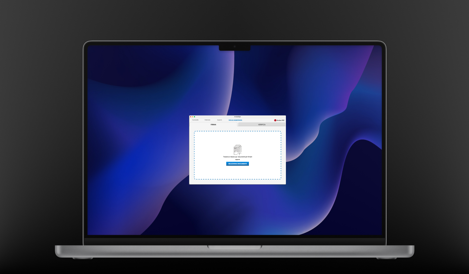
The Idea & Flow
I produced sketches and wireframes, tested with internal stakeholders using Adobe XD. I
created two different types of homepages and two distinct methods for applying graphical
signatures, allowing us to test which approach better matches user expectations before
committing to high-fidelity work.
Testing & Iteration
I tested the proposed solutions with real users on prototypes. By iterating the process, I
conducted further user testing with the main beta version of the app, refining each flow
before release.
Testing Insights
New UI immediately clear
Users found the new UI extremely clear and easily located everything they needed without guidance, confirming the IA restructure had worked.
Secondary features now discoverable
Features beyond signing became easy to find on their own. Tab-based navigation felt intuitive — no more support calls asking where preferences were hidden.
Graphical signature preview fixed
The correct rendering meant users could finally see exactly what they'd get before applying. First-attempt success rate went up noticeably across test sessions.
Results & Impact
Six months after launch, the numbers were clear. Ongoing surveys track user satisfaction and pain points, feeding directly into each roadmap cycle.
-80%
Product support tickets plummeted within 6 months of the new release.
 Signing dominates usage
 Two conflicting user patterns
 Broken previews & hidden settings