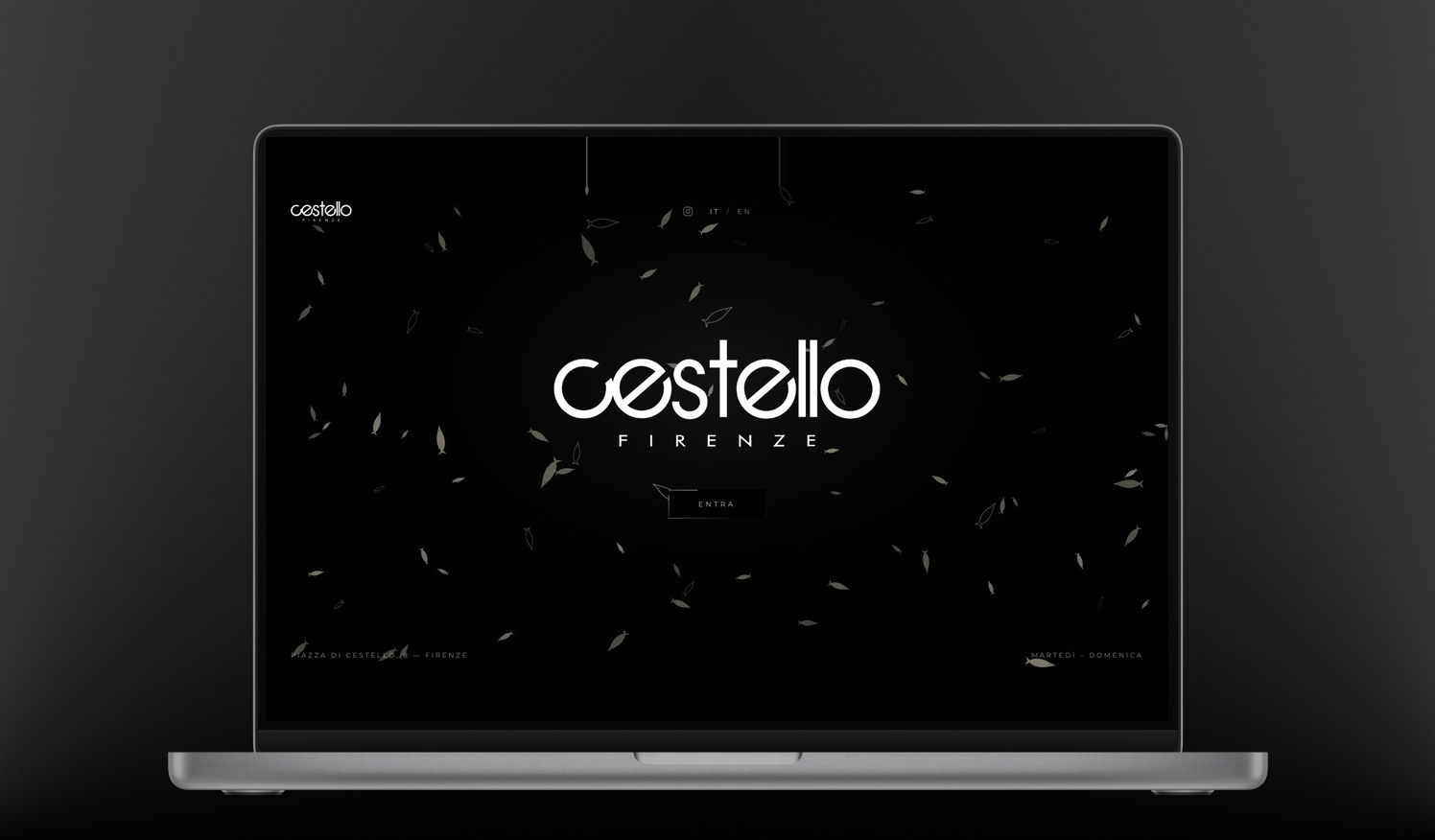
Cestello Firenze
2026
Side project · Restaurant site
Italy
Thirteen years of enterprise products teach you restraint. When a million people depend on a screen to send an invoice, the right answer is almost always the quiet one, and the interesting idea is usually the one you talk yourself out of. So every so often I take a weekend and build something where restraint isn’t the point — where interaction and motion get to be the whole argument.
Cestello is a fish restaurant and cocktail bar in Piazza di Cestello, in Florence. The owner asked for something modern and interactive — not another restaurant template with a photo carousel and a menu in PDF. That brief is an invitation and a trap at the same time: “interactive” is easy to deliver as noise, and a restaurant site still has one job, which is to get someone deciding where to eat tonight to the address, the hours and the booking button.
My role: everything — design, art direction, front-end build, and the bilingual copy structure. Weekends, over a few weeks.
Motion that belongs to the place
The site opens on black, with a school of fish drifting slowly across the logo. It isn’t a looping video and it isn’t a particle preset: every fish is a body in a real physics simulation, so the shoal never repeats itself and reacts to the window it happens to be in. You know what kind of restaurant this is before you have read a single word.
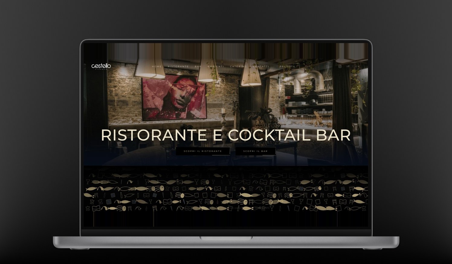
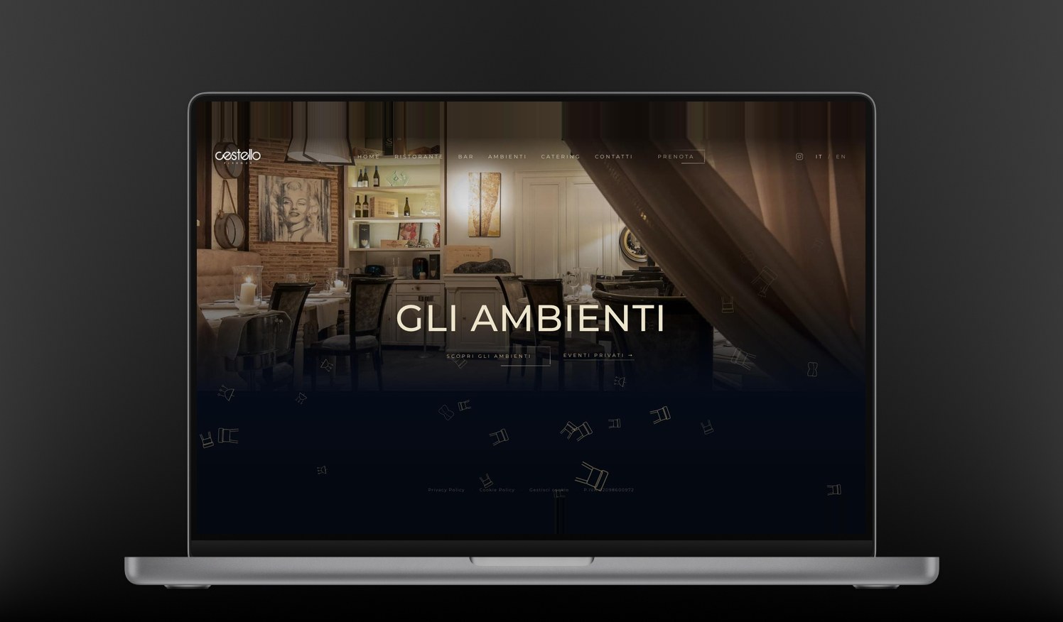
That idea then had to survive six pages without becoming a gimmick, so the objects change with the section: a shoal at the entrance, then tableware, glasses and chairs drifting through the inner pages, and chairs and party props on the one about private events. Same physics, different vocabulary — the motion tells you where you are, which is a navigational job disguised as decoration.
Where the discipline still applies
A side project is where I let the interaction lead, not where I forget the craft. The whole animation layer respects the visitor’s reduced-motion setting and switches off for anyone who has asked their system for less movement. The content sits in the page underneath it, so the address, the hours and the booking link are reachable whether or not a single fish ever appears.
The rule I hold to, here as much as at work: an interaction earns its place if taking it away would make the page less clear — not merely less fun. The shoal passes that test. Everything that didn’t went in the bin, including a few things I liked.
How it’s built
Plain HTML, CSS and JavaScript. No framework, no CMS, no build step — six static pages, bilingual in Italian and English, that a browser can render the moment the first bytes arrive.
-
●
Matter.js
The 2D physics engine behind the shoal and the falling objects. Bodies, forces and collisions are simulated for real, which is why the motion never loops and never looks authored. -
●
GSAP
Everything that is choreographed rather than simulated: entrances, page transitions, the timing of the type. Physics for what should feel alive, timelines for what should feel directed. -
●
Vanilla everything else
One shared stylesheet, one shared script, a GDPR-compliant cookie consent layer, and web fonts. Nothing to compile, nothing to keep patched. -
●
Static hosting
Chosen on purpose: this has to load on a phone with one bar of signal outside the restaurant, and still work in three years with nobody running updates on it.
Choosing no framework was itself the design decision. The heaviest thing on the page is the idea; everything else stays out of its way.